


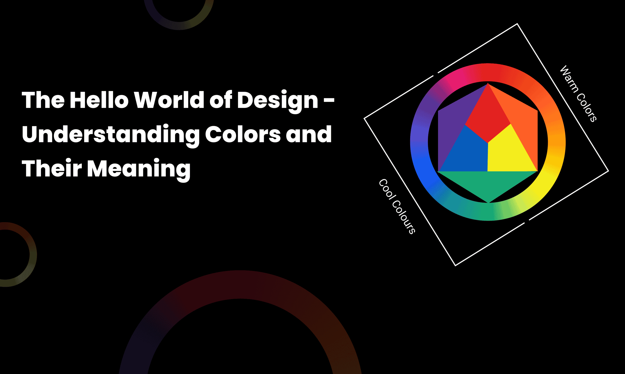
When it comes to designing, we give so much importance to fonts and images, but forget about the most basic element — Colors. Colors can either elevate or destroy the look of your design. They play an important role in communicating brand identity and creating user experiences. The use of colors in a design is a conscious decision that requires not only a lot of thought but also strategic planning. And that’s because color can have significant implications on how users perceive your brand and its products or services. So let’s explore the world of color and its meanings!
Table of Contents
Understanding Color Context
Color context is the environment in which a color is viewed. It includes the physical surroundings and the viewer’s emotional state. In other words, color context can be described as the relationship between what you see and how you feel about it.
Everything from your clothing to the décor of your room can affect how you perceive your surroundings. For example, if you’re wearing a bright red dress, you might feel cheerful or excited. Conversely, if you’re dressed in black and wearing dark sunglasses, you may feel gloomy or depressed. Colors also have an impact on how people perceive each other as well. If two people are dressed identically in yellow and green, they may appear to be friends; however, if they’re both wearing red and standing next to each other at a party, they might come across as enemies.
As humans, we all have natural tendencies to react to colors in different ways. Our emotions can drive us to make assumptions based on these reactions. This is why it’s so important for designers to consider the context in which their clients are viewing their products when creating marketing materials.
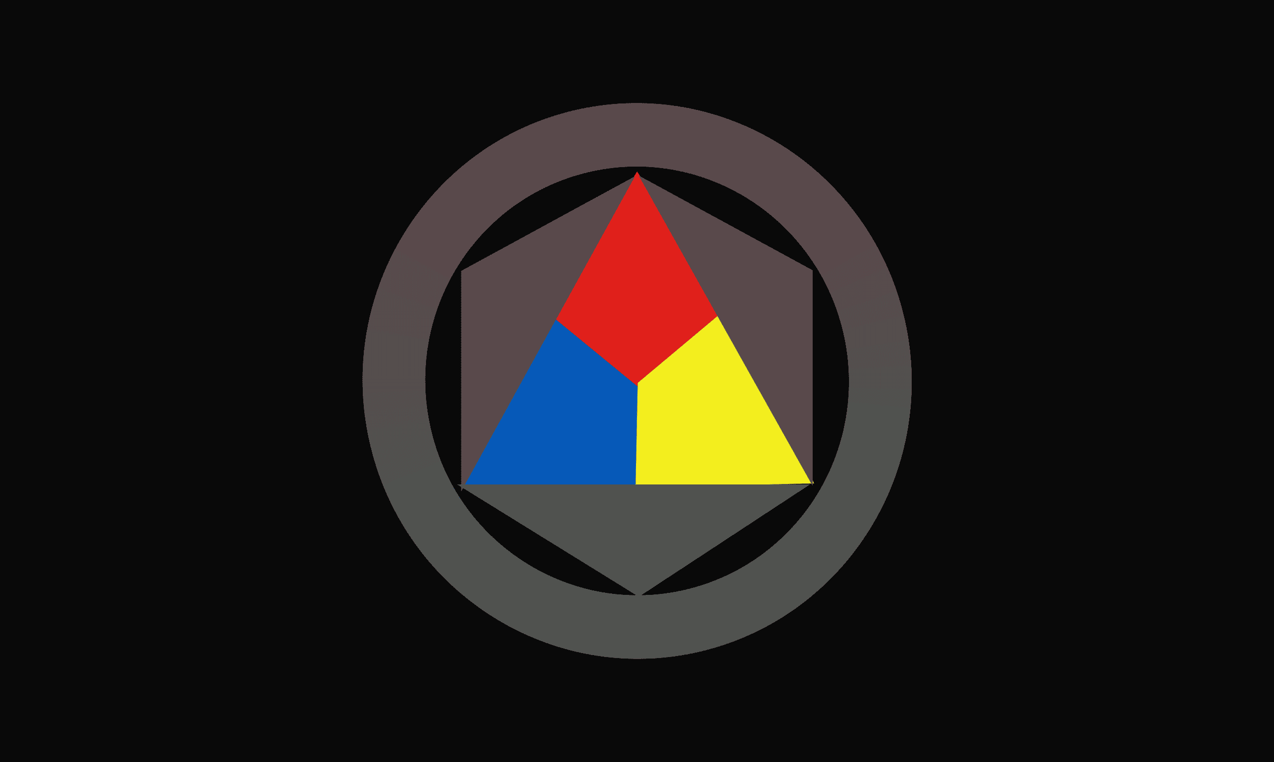
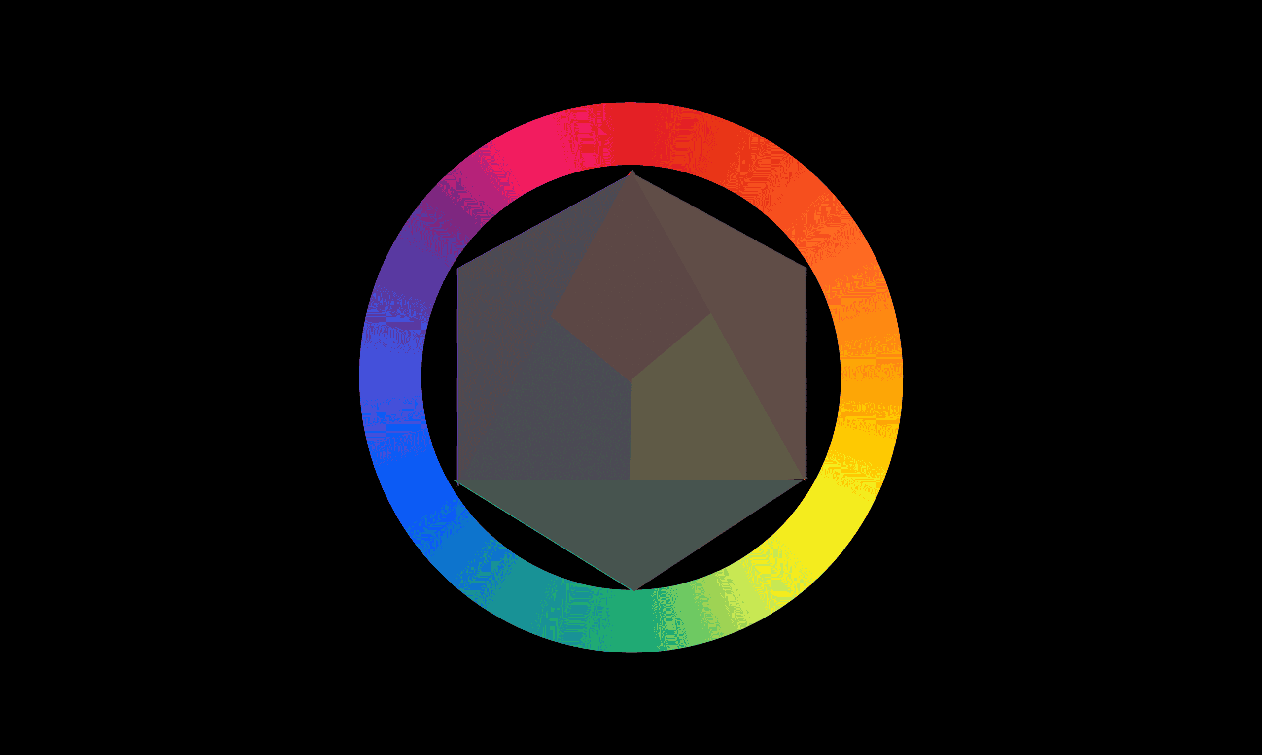
Primary Colors – Red, Blue, Yellow
Primary colors are the colors that can be combined to create all other colors. The three primary colors are red, yellow, and blue.
- Red is the color of fire and blood, and it is associated with passion, energy, and power.
- Yellow is the color of the sun and it is associated with happiness, positivity, and energy.
- Blue is the color of the sky and it is associated with peace, calm, and serenity.
When mixing colors in a painting or painting on a blank canvas, it’s best to start with a primary color. You can mix all three primary colors into one color and then paint accordingly. This is the most common way to create different colors for your work.
If you want to use a specific color, you would have to break down the other two colors from your primary colors and use the remaining colors to create your desired color. Also, when working with any media such as pencils, markers, or crayons, it’s best to start with a primary color before you add in any other colors.
Secondary Colors – Purple, Orange, Green
Secondary colors are the colors that are created when mixing the primary colors. The combinations of the primary colors make up the secondary colors. They can be either less saturated, or more saturated than the original color.
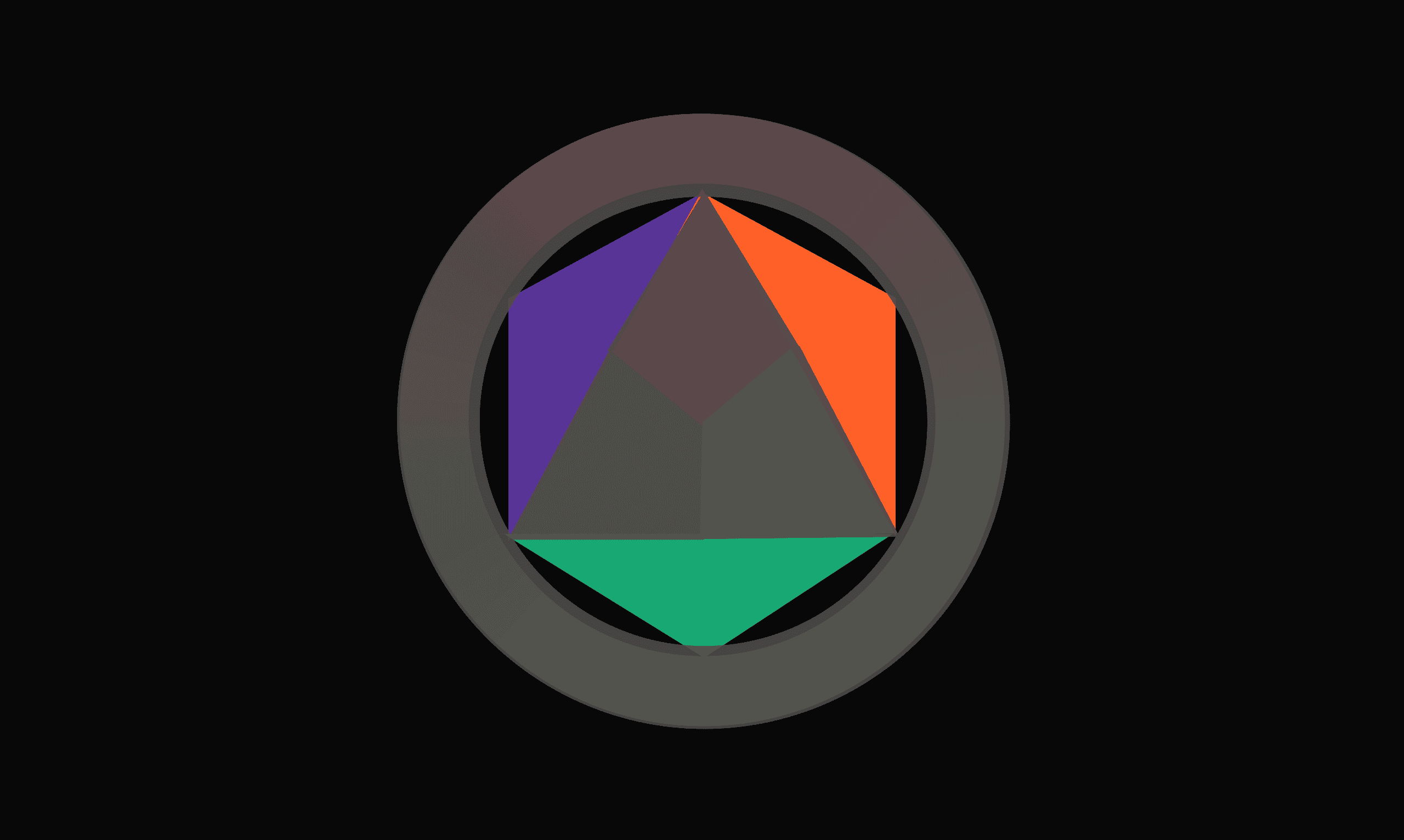
- Purple is a secondary color because it is derived from red and blue, which are primary colors. The word “purple” comes from the Latin word for purple, purpura. Purple has become an iconic color of royalty and aristocracy because of its association with wealth and power.
- Green is a secondary color because it is derived from blue and yellow, which are primary colors. Green is a cool color that symbolizes nature and cleanliness. It has been associated with money, prosperity, and health for thousands of years. In the middle ages, green was worn by royalty as a sign of wealth and status.
- Orange is a secondary color because it is derived from yellow and red, which are primary colors. Orange is a warm, bright color. It stands out against other colors in nature. It is one of the first colors that children learn to recognize and associate with food, including carrots and oranges.
Tertiary Colors – Combination of Primary and Secondary Colors
Tertiary colors are those that are made by combining primary and secondary colors. The tertiary color is created by mixing equal parts of all three primary colors together, in this case, red, yellow, and blue.
The secondary colors will still be present in the tertiary color, but not as much as they were in their own forms of light.
For example: If you were to mix equal parts of red, yellow, and blue together to form a new color then you would have an orangey-brown that was different from either one of the two primary colors alone. This color can be represented by the RGB values 255/0/255 which would be represented as #FFA500 on your computer screen.
Warm vs. Cool Colors
Warm colors are usually rich in reds, oranges, yellows, and browns. These colors are energizing and passionate. They are usually associated with feelings of warmth and safety. They tend to be more energetic and exuberant, with some exceptions.
Cool colors include blues, greens, grays, and sometimes blacks. Cool colors are calming and soothing. They can make us feel calm or relaxed. They tend to be more subdued and subdued than warm colors, but can still be very lively in their own right.
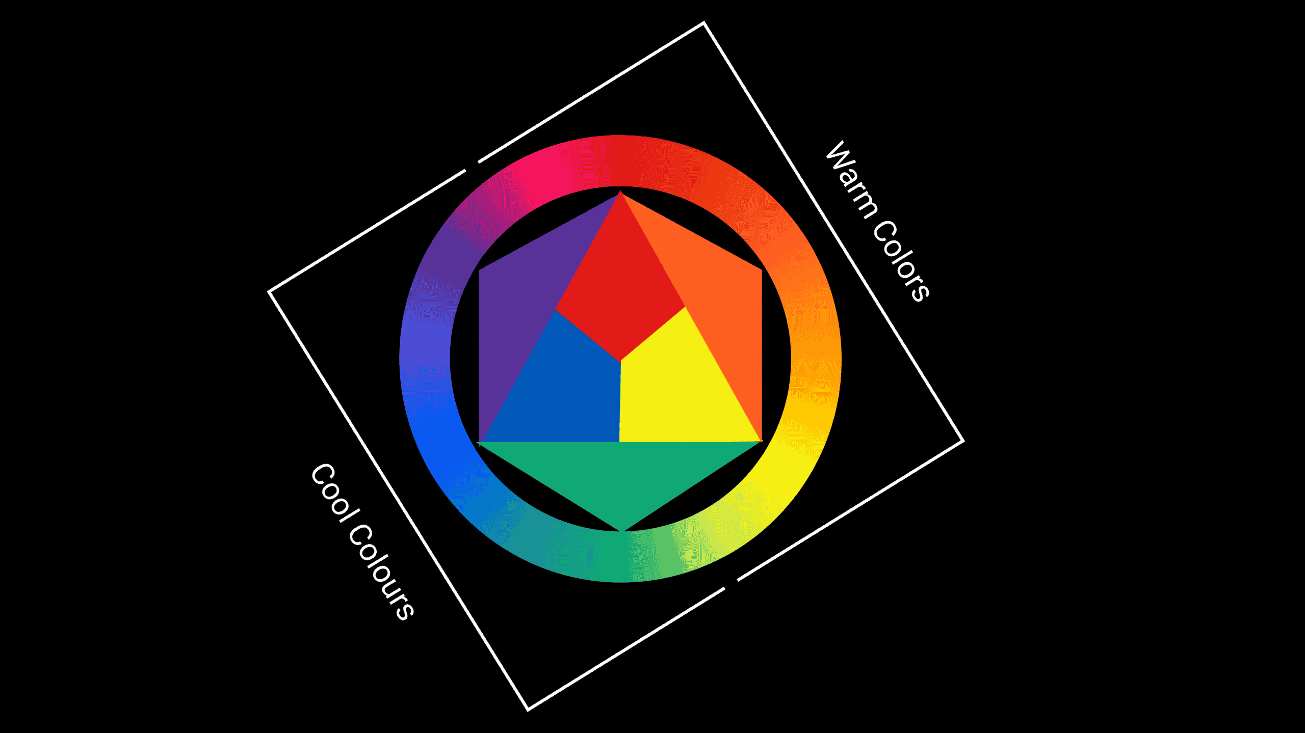
You’ll notice this when you’re looking at an image or video that has been designed with warm or cool colors — for example, a sunset or sunrise has a warmer feel than one in the middle of the day.
Neutral Colors
Neutral colors are neither warm nor cool so they don’t have a particular feeling associated with them. These colors are those that don’t have any specific meaning or emotion attached to them. The purpose of these neutral colors is to create harmony in a room by making everything look similar but not too similar so that it doesn’t overwhelm the viewer’s eye with too much information at once.
For example, neutrals include black, white, and gray which all have no distinctively positive or negative associations with them. This means they can be used more widely across different types of media without having any specific associations that could cause confusion among viewers.
Tint vs Tone vs Shade
The terms “tint”, “tone”, and “shade” are often used interchangeably, but there is actually a difference between them. A tint is a hue with white added to it, resulting in a lighter color. A tone is a hue with gray added to it, resulting in a color that is neither light nor dark. A shade is a hue with black added to it, resulting in a darker color.
Takeaway: Use color contexts to create better designs.
Color is one of the most important aspects of design. It can help to convey meaning and mood, it can help users find your content and it also has a huge impact on how your designs look. There are many ways to use color in your designs but first, you need to understand what color means from a design perspective. They can be used to convey emotions and make a piece of work more memorable. However, if used incorrectly, they can be disastrous.
Every color has its own meaning, and it’s important to know what those colors mean so that you can use them in their correct context. It’s important that designers understand how color works so they can create better designs by using color properly.
FINAL VERDICT :
If you have read this far, I really appreciate it. I hope you enjoyed reading this article on “The Hello World of Design – Understanding Colors and Their Meaning”, If yes, then don’t forget to spread the word about it Click your favorite social media icon below to share this content. Signing off sowmiyavenkatesan611@gmail.com