


Excel has this amazing feature called Trend analysis which helps the user to identify the trends or projections of data using trend graphs. It’s always good to feature when you deal with financial data the user could able to project the future data. In this excel tutorial, we will look into How to do excel trend Analysis with Sparklines and Trendlines.
Table of Contents
What is Sparklines Analysis in Excel
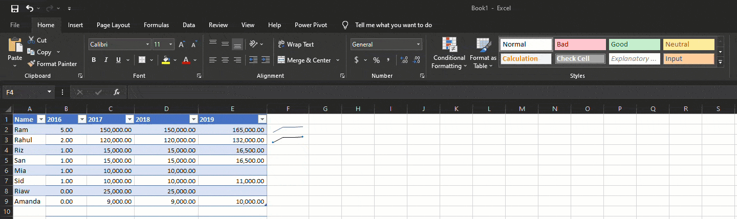
Sparkline will help us to insert a small chart into a single cell. To embed charts in a single cell, this can be inserted from the Insert tab. Select the cell you want to add and click on the Sparkline section in the insert tab. Select the range you want to add. For a large set of data, you can utilize the fill handle tab to drag the Sparkline to other cells rather than one at a time.
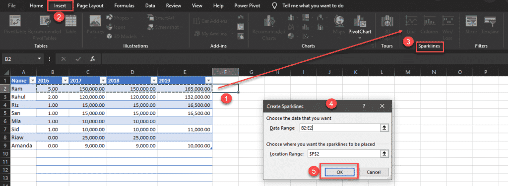
You can use Column and Row Data with Sparkline features, Sparklines also offers features like Marking High points, Markers, Low point customization. Below shown how to use all Sparkline features for trend analysis in excel.
Trendlines Analysis in Excel
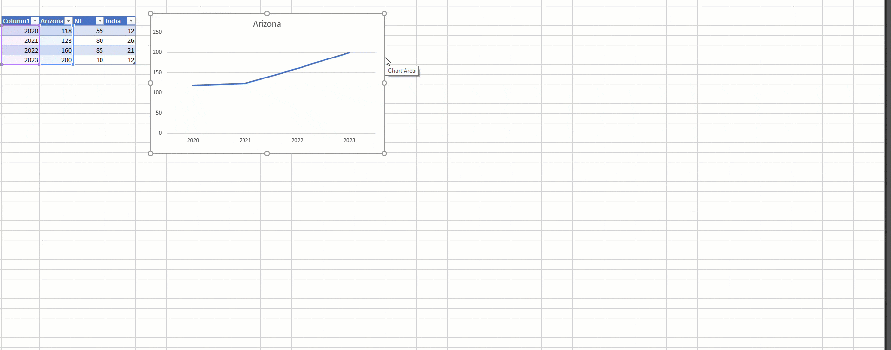
Trendlines are just like predictions or show us the predicted values in the form of a graph. To initiate select the col you want to add insert line chart from the Insert tab. Now a Line chart will form. Click on the line click on the + bar icon on the right, select Trendline from the list.
Now you have a linear trend line and check the R square value to see your R2 score which shows you how accurate your trend line is. R square value range between 0 to 1. Here we got a value range of 0.92 which is very close to 1. You can try changing Linear to Exponential to see the R square value is changing or not.
An Exponential trend is good if our data is increasing at an same rate.
What are the Type of Trend Lines
The following are the Trendlines analysis in excel, having good knowledge in Linear regression will help us to understand the above topic much easier.
- Exponential – As discussed above good to use when data with constant increasing rates.
- Linear – Linear helps to show a steady growth
- Logarithmic – Precisely shows the rate of changes in the data ups or down
- Polynomial – More suits on volatile data (eg: Cryptocurrency example)
- Power – Almost similar to Linear which shows the value with change in rate
- Moving Average – Data which has fluctuations.
FINAL VERDICT :
In conclusion, I hope you enjoyed reading this article on “How to do excel trend Analysis”. You can refer to our Excel Tutorials for beginners to learn other Excel functions. Signing off Sanjay Kv