Color Psychology for Designers: Marketing and Appealing to Your Customers
Color psychology is a fascinating subject that is frequently disregarded. It’s not a magic trick that will make you money, but it can give you a competitive edge in terms of marketing your own designs. For designers and marketers, they are just colors. But the colors that your customers see can make or break your products or services. What colors do you choose for your target customers? This blog will look at the different aspects of color psychology and how it can be used for marketing.
Table Of Content
- What is color psychology?
- The science of color psychology
- What emotions do different colors invoke?
- How to use color psychology for design?
- How to effectively use it for marketing?
- Takeaway: Color plays a significant role in our marketing strategy and how it is perceived by the end customer. So use it wisely.
- Final Verdict
What is color psychology?
Color psychology is the study of how colors influence our feelings, actions, and perception. People react to colors differently, and color psychology can be applied to produce desired effects.
For example, the color red is often associated with passion and energy, while blue is associated with calm and relaxation. By understanding the different effects that colors can have, we can use them to influence our own moods and behaviors.
The science of color psychology
Color psychology is a science, and it’s been studied for decades. The concepts of color psychology were developed by the German psychologist C.G. Jung in the early 20th century, who believed that certain colors had a symbolic meaning and helped shape our behavior.
Color is a powerful tool that can influence your emotions, attention, and mood. It has been used to sell everything from cars to insurance policies to cosmetics. Color affects people’s moods, so it’s important to know how color works in your customers’ brains.
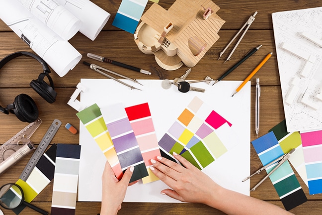
Color psychology is not just about understanding customers’ reactions to your product’s color choices. It also helps you understand how people think about your brand and its products, so you can create more effective marketing strategies and engage with your audience in meaningful ways.
For example:
- If you want to increase sales of your product, try using a color that evokes happiness or excitement.
- If you want your customers to buy more products from you, try out vibrant reds or oranges — especially when they’re used in combination with other colors like gold or green.
What emotions do different colors invoke?
The color psychology of colors can be used to create a mood or to evoke certain emotions. For example, if you want your customers to feel energetic and happy, choose bright colors such as red and yellow. If you want them to feel calm and relaxed, choose purple and blue.
The same is true when it comes to marketing. When you’re creating a brand new product or service, it’s important to think about how you can use color psychology in order to get the most out of your marketing efforts.
Red is passionate, bold, and energetic. It evokes excitement and energy. Red can be used for sports teams or any activity that needs high energy. Its bright color makes it appealing to the eye and makes it stand out against other colors. It can also be used in a bold way to show enthusiasm or passion.
Yellow is cheerful and inviting, making it a good choice for promotions that need to attract attention or grab people’s interest. Yellow is seen as the color of happiness and optimism because it has such a sunny vibe, so use it to make customers feel good about their purchase.
Orange is energizing, lively, and positive. It’s also warm, sensual, friendly, and approachable — all qualities that make this color perfect for marketing campaigns. Orange can boost sales by making buyers feel warm toward your brand.
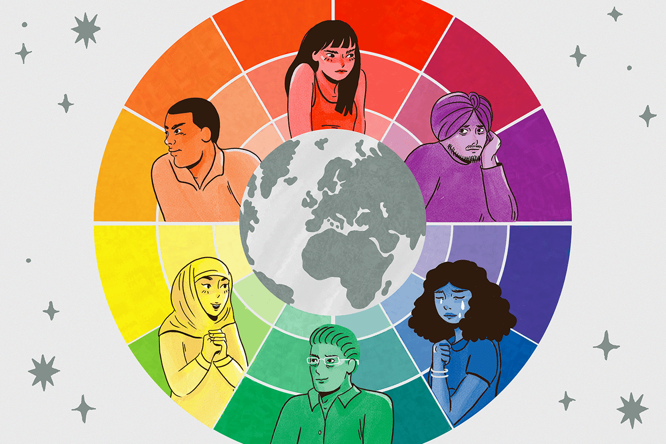
Green is calm yet powerful, making it a great choice for calming down agitated customers who are looking for products that will bring them serenity and peace of mind. Green is thought to stimulate growth in nature — which means this color has powerful healing properties as well!
Blue evokes trust, loyalty, calmness, and peace. It’s a great starting point for your marketing campaigns because it portrays the idea that you are trustworthy and honest. Blue can also suggest that your brand is high-quality and reliable.
Violet is known as a “mother of all colors.” It’s associated with nobility, royalty, and spirituality. You can use this color to represent luxury or sophistication. For example, if you want to market your company as high-end or upscale, you could use violet in your logo design or in other marketing materials. Brown
Brown has been used as a color for centuries because it was believed to be the most neutral one — it didn’t have any strong associations with any particular time period or culture. Today, brown still represents neutrality but also stability; people associate it with comfortability and stability in life.
Black is a very powerful color that evokes power and strength. People associate black with elegance and sophistication because of its ability to blend in with any background or environment (when used correctly).
How to use color psychology for design?
Color psychology has been studied by psychologists for decades and its findings have been used in the design industry to influence consumer behavior. Color plays an important role in our daily lives. It affects the way we feel, think and act. The use of color can enhance your product or service by making it more appealing and engaging.
Here are five ways to use color psychology for design:
1) To evoke emotion:
Incorporating a specific color into your design will evoke a feeling of warmth or coolness depending on the hue you choose. For example, yellow is associated with happiness, but also with warmth — so if you’re trying to create an environment that makes people happy, you might want to use warm tones like red or orange instead of cool shades like blue or green.
2) To stimulate attention:
Certain colors are more attention-grabbing than others, so if you’re trying to catch someone’s eye and get them interested in what you have to say, choosing one of these colors will make them sit up and take notice!
3) To attract buyers who are looking for something specific (or don’t know what they’re looking for).
You can use color psychology as a way of attracting people who are looking for a specific product or service by using colors that relate to them. For example, if you want to design a service that caters to mothers with children under 6 years old, then use reds and pinks in your design, because these colors will appeal to this demographic group of customers.
4) To make an impression
Color can have a big impact on how we feel. When your brand or product has a strong color scheme, it will automatically make you stand out from the crowd. It’s one of those things that people notice right away and appreciate once they get used to it.
5) To enhance moods
When you have a color scheme that goes well with the overall mood of your content, it can help create a more immersive experience for users. You want to make sure that your design is consistent so that people know what they’re getting into when they come across your site or app.
How to effectively use it for marketing?
Color psychology can also be used to create a variety of marketing strategies for businesses. Here are several ways you can use color psychology for your business:
Use color to help build brand awareness: The most obvious benefit of using color in your marketing strategy is that it will help build brand awareness. Color is such a powerful means of communication that it can make or break a brand depending on how well you use it.
When used strategically, color can make your business stand out from the competition and convey a positive message about who you are as a company.
Use color to increase sales: If you’re running a small business and don’t have the budget for expensive marketing campaigns, then using color can be a smart choice. Using colors that are similar to those of competitors will help reduce confusion among consumers and give them a clear idea of where they should shop next time they’re looking for something similar to what they already own.
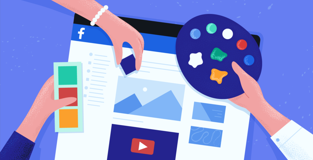
This approach doesn’t require too much investment either — just some time spent thinking about what colors would work best and then making sure your products match the brand context.
Check out my recent article on : Understanding Colors & Their Meaning
Takeaway: Color plays a significant role in our marketing strategy and how it is perceived by the end customer. So use it wisely.
Color occupies a unique position in the world of marketing. It is both a practical and an emotional tool that can be used to great effect in any number of marketing applications. From product packaging to website design, color is one of the most powerful tools at a marketer’s disposal.
However, color also has the power to backfire if it is not used wisely. The wrong color in the wrong context can send the wrong message to customers and turn them away from your product or brand. For this reason, it is important to use color thoughtfully and deliberately in your marketing campaigns. When used correctly, color can be a powerful tool for boosting your brand and driving sales. So use it wisely!
Final Verdict
If you have read this far, I really appreciate it. I hope you enjoyed reading this article on “Color Psychology for Designers: Marketing and Appealing to Your Customers”, If yes, then don’t forget to spread the word about it Click your favorite social media icon below to share this content. Signing off sowmiyavenkatesan611@gmail.com


