Choosing the perfect color palette for your design can be a daunting task. With so many colors to choose from, it’s hard to know where to start. And if you’re not careful, you could end up with a palette that doesn’t work well together. But don’t worry – we’re here to help! In this article, we’ll explain why it’s important to choose your own color palette and give you some tips on what to look out for. We’ll also show you how to choose a palette that’s perfect for your design. So, let’s get started!
Table of Contents
What is Color Palette?
A color palette is a selection of colors that are used in the design. A color palette can be used for a variety of purposes, such as choosing colors for a website or painting. Some color palettes are created with a certain mood or feeling in mind, while others are designed to be easy on the eyes. No matter what the purpose, a color palette is a helpful tool for any designer.
Why is choosing your own Colour Palette important?
There are many factors to consider when choosing a color palette for your website or project. Colors can have a psychological effect on viewers, so it’s important to choose a palette that is appropriate for your brand or message.
For example, warm colors like orange and red can create a feeling of excitement, while cool colors like blue and green can create a feeling of calm.
In addition to the psychological effects of color, it’s also important to consider the practical effects. Different colors have different meanings in different cultures, so it’s important to choose a palette that will be interpreted correctly by your target audience. For example, white is often associated with purity and innocence in Western cultures, but in Eastern cultures, it is often associated with death and mourning.
Choosing the right color palette is an important part of creating a successful website or project.
What to look out for when choosing Color Palettes?
When choosing color palettes, there are several things to keep in mind.
- Consider the overall tone and mood you want to create. This will help narrow down your choices.
- Think about the specific colors you want to use. Do you want to use a limited palette or a more diverse one?
- Consider the context in which the colors will be used. Will they be used for a website, a presentation, or something else?
- Consider the audience for the project. What colors will they respond to best?
- Think about how the colors will work together. Will they complement each other or create a more chaotic look?
- Consider your personal preferences. What colors do you like best?
- Consider the practicalities. Will the colors print well, work well on a screen, or be easy to read?
All of these factors will help you choose the best color palette for your needs.
How to choose your own Colour Palette?
When it comes to choosing a color palette, there are a few things to consider:
- Think about the overall tone and feel you want your website to convey. Are you going for something bright and cheerful, or more subdued and serious? Once you have a general idea of the overall tone, you can start narrowing down your color choices.
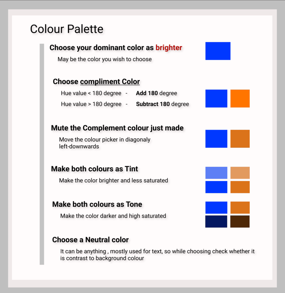
- Consider your target audience. What colors will appeal to them? If you’re not sure, take a look at other websites in your industry and see what colors they are using. You can also use a tool like Google’s Material Design Colour Tool to help you choose colors that work well together.
- Don’t be afraid to experiment! Try out a few different color combinations and see what looks best.
Once you’ve found a palette you’re happy with, you can start incorporating it into your website design.

How to integrate your chosen Colour Palette into your design?
When it comes to integrating your chosen color palette into your design, there are a few things to keep in mind, to create a color palette that will seamlessly integrate into your design. :
- Make sure that your palette works well together and that the colors complement each other.
- Consider how each color will be used in your design and if there is a specific purpose for each one.
- Think about how your color palette will work with the overall aesthetic of your design.
Check out my recent article on, Understanding Colors and Their Meaning.
https://recodehive.com/the-hello-world-of-design-understanding-colors-and-their-meaning/
Takeaway: When designing for a project, you can’t just pick your favorite colors and hope for the best, you have to make sure that the colors you choose are the best possible fit for your project.
The colors you choose will affect the overall look and feel of your project, so you need to be careful when making your selection. There are a few things you should keep in mind when choosing colors for your project:
- The colors you choose should complement each other.
- The colors you choose should be appropriate for the subject matter of your project.
- The colors you choose should create the desired mood or atmosphere for your project.
Taking the time to carefully select the right colors for your project will pay off in the end, so don’t be afraid to put some thought into it!
Final Verdict
If you have read this far, I really appreciate it. I hope you enjoyed reading this article on “How to Pick the Perfect Color Palette for your Designs?”, If yes, then don’t forget to spread the word about it Click your favorite social media icon below to share this content. Signing off sowmiyavenkatesan611@gmail.com


