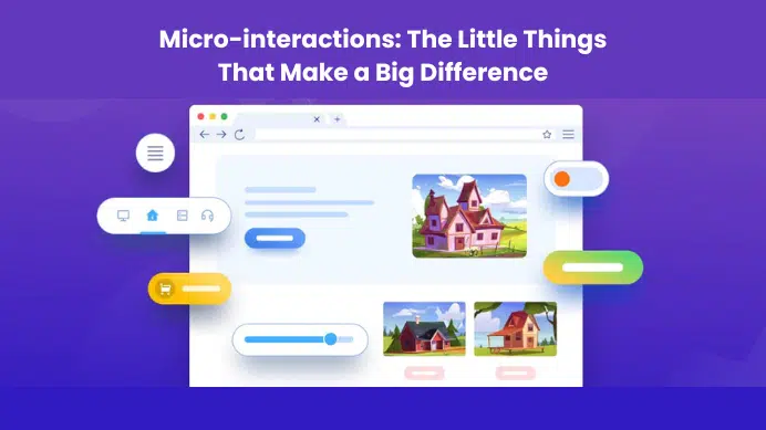


Designing with grids is one of the first ways to improve your design. A grid will help you to arrange your content in an understandable way. The grid will also help you to avoid a cluttered design that is more difficult to read. Grid systems are a great way for designers to ensure that their designs are balanced, organized, and consistent. In this blog, we will discuss the importance of grids, why we use them, and how they are relevant in terms of design.
Table of Contents
What is a grid?
A grid is a network of horizontal and vertical lines that intersect to form a series of squares or rectangles. Grids are commonly used in graphic design, web design, and architectural design. hey may be utilised to set up a visual hierarchy, repetitive components, and content organization and layout.
The theory behind grids
A basic component of web design is grid systems. They are a crucial tool for producing responsive designs since they enable designers to develop flexible and adaptable layouts.
The theory behind grids is relatively simple: they are a set of columns and rows that offer a framework for content organization. However, there are a variety of methodologies that may be used, and creating efficient grid systems is not always simple.
But in general, the idea is to design a system that is simple to grasp and use, as well as adaptable to various screen sizes and devices.
Why do we use grid systems for design?
Grid systems are a powerful tool for designers, allowing them to create consistent, structured layouts with ease. By dividing a layout into a series of rows and columns, designers can more easily position and size elements on the page. Additionally, grid systems can help to create a sense of visual harmony within a design.
There are a few reasons why designers might choose to use a grid system:
- Grids can help to create a sense of order and hierarchy within a design. By organizing elements into rows and columns, designers can control the way in which users view and interact with content.
- Grid systems can be used to create responsive designs. By using a grid, designers can more easily ensure that their layouts will look good on a variety of screen sizes.
Overall, grid systems are a valuable tool for designers. By using a grid, designers can create more consistent, structured, and responsive layouts.
What are Layout Grids and Why you should use them?
Layout grids are a crucial component of any design. They help to organize information and make the layout look more professional. They can also be used as a tool for making your layout more readable and aesthetically pleasing.
Layout grids are sometimes overlooked, but they play an important role in creating a visually appealing design. Here’s why you should use them:
1) Layout Grids Help Organize Information
Layout grids organize information in a way that makes it easier to understand and navigate your content. This is especially important when you’re dealing with large amounts of text or images, which can make it difficult to find specific pieces of information on the page. By using layout grids, you can organize the content on your page so that it is easier to navigate through and find what you need.
2) Layout Grids Can Make Your Design Look Professional
Layout grids help your design look more professional by making it easier for visitors to navigate through your content and locate what they want on your website. Using layout grids also helps create consistency throughout your site, which makes it easier for visitors to understand what they are looking at when they visit different pages or sections of your site (such as blog posts). In addition
Types of layout grids
There are four basic layout types for web pages: margin layout, columns layout, gutters layout, and baseline layout. Each has its own advantages and disadvantages, so it’s important to choose the right one for your project.
- Margin layout is the simplest type of layout, and is often used for single-column pages. The content is centered in the middle of the page, with equal margins on all sides. This can be a good choice for pages with a lot of text, as it is easy to read. However, it can be difficult to add other elements to the page, such as images or videos.
- Columns layout is more complex than margin layout but can be more flexible. The content is divided into columns, with gutters between them. This can be a good choice for pages with a lot of content, as it allows you to add more elements without making the page too crowded. However, it can be difficult to align all of the elements on the page, and the columns can be difficult to read if they are too narrow.
- Gutters layout is similar to columns layout, but with more space between the columns. This can be a good choice for pages with a lot of content, as it allows you to add more elements without making the page too crowded. However, it can be difficult to align all of the elements on the page, and the columns can be difficult to read if they are too narrow.
- Baseline layout is the most complex type of layout, and is often used for multi-column pages. The content is aligned to a baseline, with gutters between the columns. This can be a good choice for pages with a lot of content, as it allows you to add more elements without making the page too crowded. However, it can be difficult to align all of the elements on the page, and the columns can be difficult to read if they are too narrow.
Why layout grids matter in interactive design
Layout grids are a great way to keep content organized visually. When you use a grid system, you’re able to clearly define the spaces between images, text, and other elements so that they stay in their proper place throughout the project. This keeps your overall layout clear and concise while also allowing users to easily understand how each piece relates to one another.
Example #1: Interactive design
Layout grids are especially useful when working with interactive designs because they help guide users through the experience by keeping everything organized and easy to understand. The grid system below gives readers clear visual cues about where they should focus their attention at all times (even if there is no text or images onscreen). In addition, it allows for easier navigation by providing a sense of direction within each section (such as left/right arrows that connect sections together).
Example #2: Graphic design
If you’re a graphic designer, you often see your work in publications and on the web. The grid is a great way to organize and present your visual elements, whether they’re text or images. Each grid item—such as a headline, small graphic, photo, or icon—is placed in one of the four corners of the grid.
Example #3: Product design
Product design is all about creating something that’s functional and usable. The grid can help you achieve this goal by making sure everything looks good when it’s scaled up or down. You can also use grids to align elements on your page so they look uniform when they’re viewed at different sizes.
Top 5 rules for best practices layout grids in interactive design
Grids are an essential component of layout design, and the best practices for creating them range widely. Here are five rules to help you create the best grids possible:
1. Use consistent grid systems for your design
The most important rule is that you should use grids for the same style of design in different parts of your project. For example, if you’re designing a website and you want to create a consistent look with your desktop and mobile interfaces, then it’s a good idea to use the same grid system across all of them.
2. Create an outline grid
An outline grid is a simple way of organizing content into blocks that can be easily identified by their shape and size (usually rectangular or square). It’s a great way to ensure that your content flows well and gives the user an easy way to navigate through your site.
3. Use a column grid
Column grids are similar to the outline grid but they make use of columns instead of individual blocks — this allows users to see more content at once without having to scroll horizontally or vertically on their devices (or screens). They’re particularly useful when displaying large amounts of information or images as they give users more room per eye movement than other types of layouts.
4. Use a fluid layout
Fluid layouts are similar to column grids in that they’re broken down into columns, but they take it a step further by allowing content to flow across the page in any direction you like. This can create a more dynamic and interactive user experience, which is great for e-commerce websites that need to draw attention to their products as well as offer users an easy way to navigate through the site.
5. Use responsive design
Responsive design is all about adapting your website so it looks great on any device or screen size: whether it’s an iPhone or Android phone, an iPad or computer screen ( Desktop , laptop ), tablet or mobile phone.
Takeaway: Use grids for consistent layouts, and to communicate your design choices.
Designing with grids is a great way to create a consistent visual language across an entire website.
When you use a grid, your designs will be consistent in size, shape, and spacing. This helps reinforce the overall brand personality and consistency of the site as a whole. You can also use grids to communicate design choices about your content, layout, or color palette.
For example, if you have a color palette that’s very different from another page on your site, it’s easy to communicate that visually by using a grid. You can either use the same color palette throughout your site or mix it up by using different grid sizes on each page or even different levels of depth within your grid.
Final Verdict
If you have read this far, I really appreciate it. I hope you enjoyed reading this article on “Creating A Better User Experience: The Importance of Designing With Grids”, If yes, then don’t forget to spread the word about it Click your favorite social media icon below to share this content. Signing off sowmiyavenkatesan611@gmail.com