


Typography is an important part of any design. It has been around for thousands of years and is an important aspect of most visual design. The role of typography has evolved through time and has been used to communicate a range of messages. Today, we can use typography to convey different messages, moods, and even brand identities. Choosing the right typeface can be tricky, but with the right advice and guidance, you can make the right choices. This blog offers tips to help you choose the right typeface for your designs and how you can use them in your designs.
Table of Contents
What is typography?
The arrangement of type involves selecting typefaces, point size, line length, line-spacing, and letter-spacing.
The anatomy of a typeface
A typeface is the combination of all the letters in a font. A font is a set of glyphs that are used to display text on a computer screen or other output device such as a printer. Typefaces can be made up of many different letters, numbers, and symbols, but the most common ones are just letters; this is because it’s easier to create these shapes with a computer than manually by hand. However, every typeface has several different parts:
- x-height — The x-height is the distance between the top of the ascender (the part that extends above the line) and the bottom of the descender (the part that extends below the line).
- caps height — The caps height is defined by the size of capital letters compared to lowercase letters. The x-height and cap-height are typically related, but not always. For example, a font with a low x-height may have a high caps height and vice versa.
- Upper case letter — The upper case is the largest letter in a font. It is usually capitalized or used as the first letter of a title. The upper case may be used to emphasize a word or sentence, or to mark formal titles and headings.
- Lower case letter — The lower case is the smallest letter in a font. It is usually not capitalized, but it may be used to begin a sentence or title. The lower case may also be used to add emphasis to a word or phrase.
- Ascender Line — An ascender line is the top of a letterform such as an upper case letter.
- Descender Line — A descender line is the bottom of a letterform such as a lowercase letter.
- Middle Line — The middle line is the vertical center of a letterform and can be thought of as its x-height.
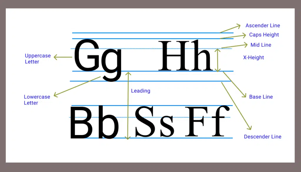
- Baseline — The baseline is the imaginary horizontal line on which letters rest. This is usually drawn at about 1/6th the height of the tallest point in a typeface or about 1/3rd to ½ inch from the top or bottom of a line of text. It’s important to know where your baseline is so that you can properly align your text with it and avoid making “spilled whites” (white space on either side of your characters).
- Leading — It is the distance between baselines and descenders in relation to their endings (the ends of lines). The amount of leading determines how thick your lines are relative to one another—so if you want thin lines, you need less leading than if you want thick ones.
- Alignment — Alignment refers to how you position your text on the page so that it looks consistent with surrounding text or other elements on the page. You can align your text left, right, center, or justified (or justify it).
- Glyph — A glyph is an individual character in a font. Glyphs contain no spaces or punctuation marks and they’re usually found at the end of words or in between words. They’re also referred to as “glyphs” because they look like letterforms (glyphs). For example, in the word “hello,” there are two glyphs: h and l (the capitalized H and lowercase l).
The Basics of typeface
The first step in choosing typefaces is understanding the basics. The most important thing to know is that there’s no “one” typeface. Every typeface has been designed to fit within a certain category or style, and each category has its own set of rules that determine how it should be used on a page or screen. This means not all typefaces look good together, and not all look good in web-based designs — even if they’re all serifs (the most common category). So before you start looking at fonts, make sure you know what they are.
Below you’ll find a breakdown of what makes up each letter in a typeface, as well as how to choose the right one for your design:
- Bowl — A bowl is the top half of a letter — it’s the part that you see when you’re looking at capital letters. A bowl can be curved or straight, depending on whether it’s meant to resemble the shape of an actual bowl or an abstract design (like on an italic).
- Crossbar — it’s where one leg comes from and extends beyond another leg. The crossbar is usually thinner than the serifs that sit below it, so we refer to them as “crosspairs.”
- Serifs — Serifs are small lines that curl around in towards the end of a character’s strokes. They make up part of the “serif” portion of a font, which means they have their own unique characteristics compared to other parts of a typeface (like bowls).
- Terminal — The terminal is the main part of a letterform, it is where the stem and base meet. The shape of the terminal can change according to various factors such as its position in the letterform or its width.
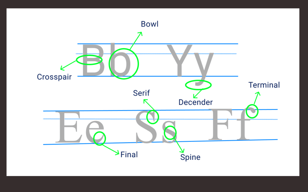
- Spine — The spine refers to the vertical lines that run between all letters in a word or sentence. It is usually horizontal as seen in lower case letters and vertical as seen in upper case letters. Spines can either be straight or curved depending on their position in the typeface.
- Final — The final refers to the decorative elements that make up some portion of a letterform such as serifs (the little projections at the ends of strokes), drops (small decorative elements), swashes (swirls), etc., which are used to draw attention to those areas while adding variety and interest to them.
- Ascender — The ascender is the raised part that extends above the baseline.
- Descender — The descender is the lowered part that extends below the baseline.
Different types of Typefaces
Typefaces can generally be classified into four main categories: serif, sans serif, script, and decorative.
- Serif typefaces are those with small lines or embellishments at the ends of the main strokes of the letters,
- Sans serif typefaces are clean and simple with no such embellishments.
- Script typefaces are based on the fluid, cursive handwriting of human beings,
- Decorative typefaces are ornate and attention-grabbing, often used for headlines and other short pieces of text.
How to create contrast in your typography
In the world of typography, contrast is one of the most important aspects to consider. The core of your design should be bold and strong in order to express your message clearly.
Contrast doesn’t necessarily mean using two different typefaces or fonts; it can also be achieved by varying the size, weight, and color of a single font. Here are some tips on how to create contrast in your typography:
- Set the baseline – The baseline is the invisible line that separates one word from another. It should be set at a consistent distance from all characters in order to avoid any confusion in terms of reading or viewing.
- Use variations – Different weights and styles can also help create contrast between your text and its background.
- Use white space – White space allows for a clean look without cluttering up your text with extraneous elements such as type, lines, or images. It also helps to separate different sections within your text so that it’s easier for readers to find their way around than if everything was crammed together into one big block of writing.
7 Factors to consider when choosing the right typography for your Design
Typography is one of the most important elements in any design. It can make or break your design and help create a great brand identity.
It’s important to choose the right font for your design. You don’t want to use a font that doesn’t fit with your overall branding and style.
Here are 7 factors to consider when choosing the right typography for your Design:
- Font Family – In this case, you have a lot of options, but it’s important that you choose something that fits your brand and style.
- Font Style – There are many different styles available, including serif, sans-serif, script, formal and informal. When choosing a font style, think about how it will look on an entire page versus just one word or letter.
- Font Size – The size of your font affects readability and legibility so it’s important to choose one that works best for your project layout. It also affects how much space it takes up on a page so make sure you know how big or small you need it to be before making any changes!
- Case Sensitivity – Depending on the type of design you are creating, you may need to use either all uppercase letters or all lowercase letters. For example, if you are creating a logo, you will likely want to use all uppercase letters. However, if you are creating a document or website, you will probably want to use a mix of both uppercase and lowercase letters.
- Line Height – Line height refers to the height of each line (the space between lines). It can be measured in points or pixels. You need to determine how much space you want between each letter in order for your text to be readable.
- Letter spacing – Letter spacing, or the spacing between letters, can affect the readability and legibility of your text, so it’s important to choose a font with appropriate letter spacing for your design. For example, if you’re creating a design for a website or app, you’ll want to choose a font with relatively tight letter spacing so that users can easily read the text on the screen. On the other hand, if you’re creating a print design, you may want to choose a font with wider letter spacing to make the text more readable. Ultimately, it’s up to you to decide what letter spacing works best for your design. Just be sure to keep readability and legibility in mind when making your decision.
- Tracking – Tracking refers to the spacing between letters in a word or phrase. It’s important to consider tracking when choosing typography because it can impact the overall look and feel of your design. If the tracking is too tight, the text can appear cramped and difficult to read. On the other hand, if the tracking is too loose, the text can appear scattered and unorganized. Finding the right balance of tracking is essential for creating a well-designed piece.
Takeaway: Typography plays a key role in web design and web development. It is important to choose the right typography that matches your project’s needs and audience.
Typography plays an important role in both web design and web development. The right typography can make a big difference in how your website or app looks and feels, and can help to ensure that it is accessible and easy to use for your target audience.
There are a few things to consider when choosing typography for your web project. Firstly, you need to think about the overall tone and style of your site or app and choose fonts that will complement this. Secondly, you need to consider the readability of your text and make sure that the fonts you choose are easy to read on both desktop and mobile devices. Finally, you need to think about accessibility and choose fonts that will be accessible to as many users as possible.
With so many different fonts to choose from, it can be difficult to know where to start. However, by considering the needs of your project and your target audience, you can narrow down the field and choose the perfect typography for your web project.
Final Verdict
If you have read this far, I really appreciate it. I hope you enjoyed reading this article on “How to Choose The Right Typography For Your Design?”, If yes, then don’t forget to spread the word about it, Click your favorite social media icon below to share this content. Signing off sowmiyavenkatesan611@gmail.com