


Before Getting Started, I would really recommend looking into the previous post which deals with the Line chart and setup of Tableau in Windows 11. The Sample Data we gonna using in the Tutorial is attached below, feel free to download and start a new Project in Tableau software.
Table of Contents
HISTOGRAM CHART IN TABLEAU
The below step is optional and just to visualize the data, creating a Histogram will start from the next steps by creating bins. Here is the scenario to visualize the Movie based on the Runtime Minutes and find which movie ran more time comparing others using a histogram.
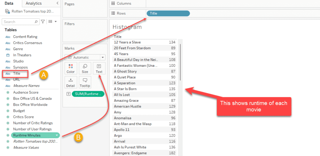
Drag and drop the Title to Rows and Runtime Minutes to the Text this will give us a table below which summarise the Movie with Runtime.
Creating Bins for Histogram
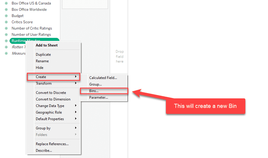
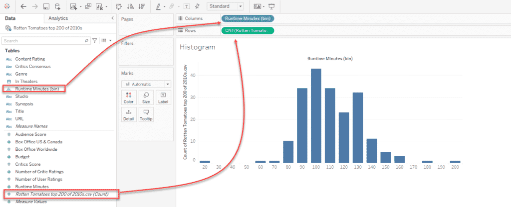
Step 1: Bins are Equal width data grouped by the chart, you can set the width as shown below, Right-click on the Runtime, and click on the Bins option from the Create menu. In the next screen, the user has to select the Bins size.
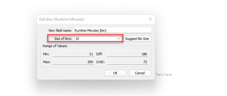
As mentioned above select the Size of the bins. Here we have given bins 10, Now new dimensions will be created
Step 2: Drag the Runtime Minutes Bin which we create in Step 1 to Columns as shown below, and the same Tableau created Count (in italics) to The Rows which will generate a below Histogram. From this Histogram, you get to know this is Normally distributed.
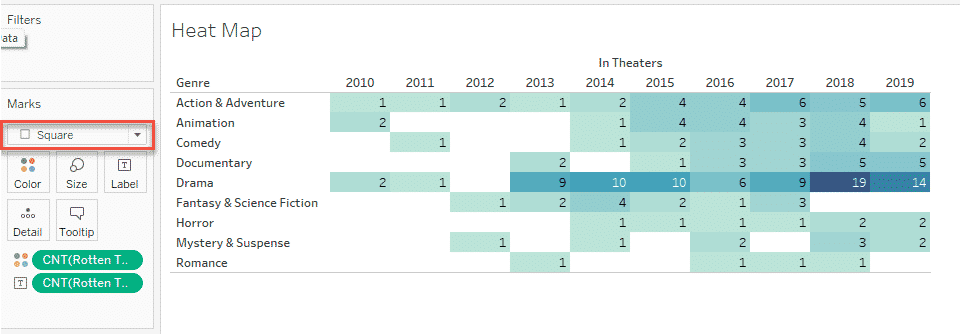
Heatmap Implementation in Tableau
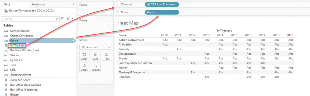
A Heatmap can be used to tell the variable relationship. So the scenario is to find which genres were most popular and where years there is no numeric value here we need to add the same. Similarly, you can display the data along with different color densities to make visualization much easier.
Step 1: So the same like we did before drag and drop the Genre to Rows and In Theatres to the Columns.You have got the Table with Labels here now it does still not look like a Heatmap, we need to add colors to it.
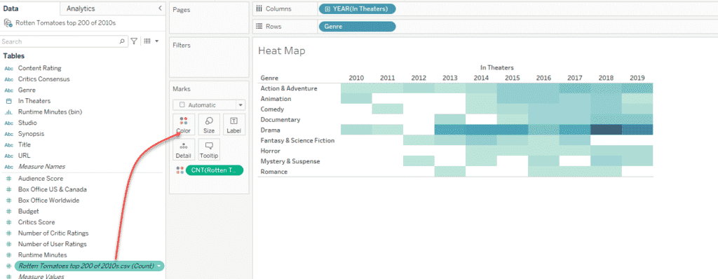
Step 2: In this step, we are going to add the color to the Table. Click on the Tableau Generated Count as shown below and drag and drop the same to colors, the below heatmap will generate instantly.
Step 3: I Will try to add more features to the Heatmap. The scenario is we need to show the labels in each cell for this you can drag the count to Text.
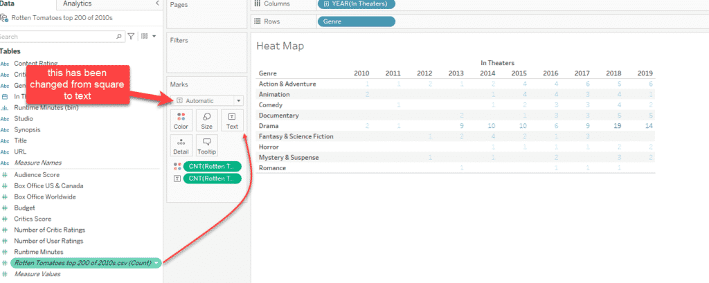
Step 4: Some may have noticed the above step didn’t come out well, what happening is like the Square changed to automatic, change to square again, you will be getting a similar chart on your screen as well.
FINAL VERDICT :
In conclusion, I hope you enjoyed reading this article on “Creating Histogram & Heatmap in Tableau”, Next post deals with Handling different types of Treemaps in Tableau. Check out that post and let our team know what Tableau Tutorial you expect next. Signing off sanjay@recodehive.com