


In the previous tutorial, we have covered how, to begin with, Tableau and a small demo on Bar Chart, Moving on Chart Types are a really important part of visualization, In this post will look into Chart Types in Tableau | Line Chart Implementation.
Table of Contents
Chart Types and Implementation Scenario?
Understanding the Chart Types is one of the important things in Visualisation, A bad representation of data can be misleading and produce bad effects. Below are a very brief summary of the most useful chart types in Tableau and their usage scenarios.
| Chart Type | Usage Scenarios |
|---|---|
| Line Chart | For Data that changes continuously |
| Bar Chart | Compare groups of Data |
| Histogram | Frequency Distribution |
| Heat Maps | Visualizing volume of data |
| Tree Maps | For Hierarchical data |
| Axis Charts | For Explain the relation between two variables |
| Scatterplots | Observer Relationship between variables. |
| Cross-Tab | Explains Correlation changes |
| Boxplots | Exploratory Data Analysis |
Before Getting Started, Get your Dataset for Line Chart Implementation, In case if new to Tableau expand the below tab to refer to the previous Tableau tutorials.
LINE CHART IN TABLEAU
We use Line Chart with continuous variable and it’s a common data visualization method for stocks price prediction, Analysing Growth of company website, etc. It helps the user to visualize the trend over time.
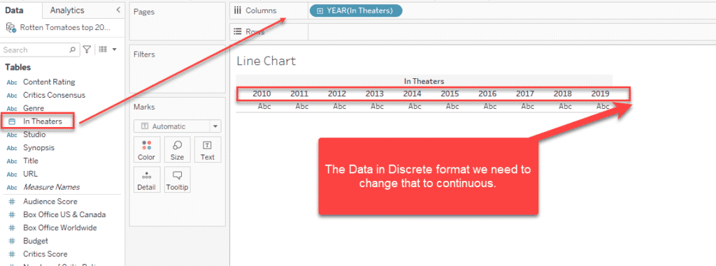
Let’s look at this scenario, we need to find out how many movies per year are recorded in our dataset. You can download the dataset from the above link and open it in the Tableau desktop/ Public version. Drag and drop the In Theaters (year data) to Columns, The data is in discrete format, need to make it continuous.
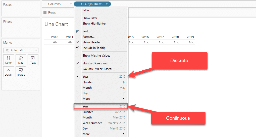
To make it continuous click on the Year Columns as highlighted below and select the 2nd Year, Now the Data header will be continuous, and can see the change in the Table below.
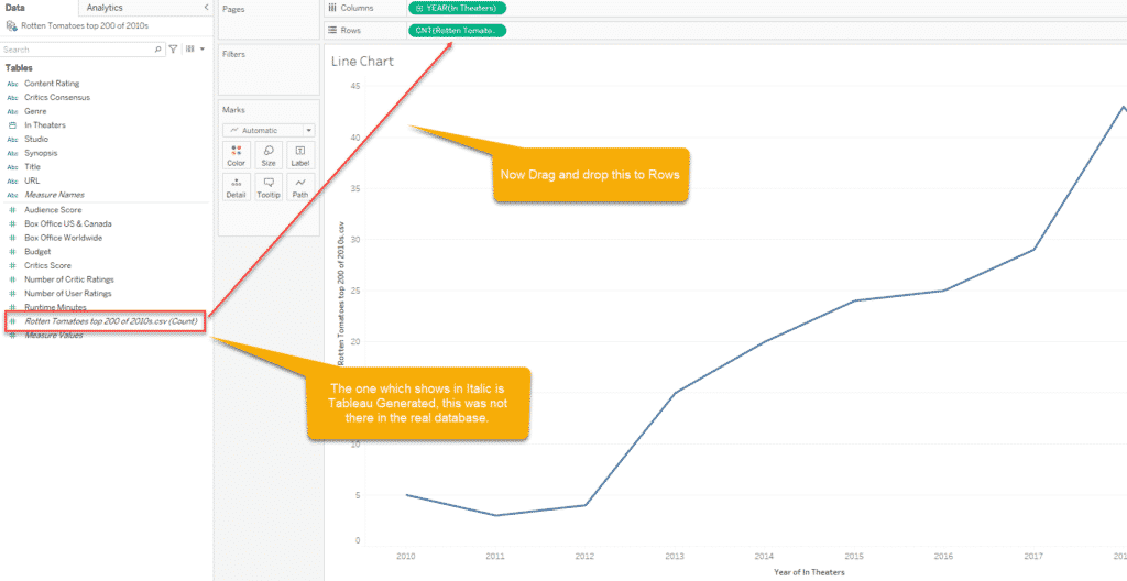
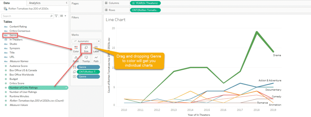
Step 1: Now you can see those changed Year from headers to the axis, All you need to do is there is count data generated by tableau which will appear in Italic, you need to drop that to row. A below-line chart will be getting. Here you may have noticed we have not selected the Line chart anywhere, it’s is because it will be automatically assigned as we have selected Automatic on the Marks.
Step 2: It’s true that the above line graph Is not visually appealing, you can see more analysis by dragging genre to Color and Number of critic ratings to the size. Again this selection purely depends upon what you want to visualize. The same way can assign the Labels to the data by drag and drop.
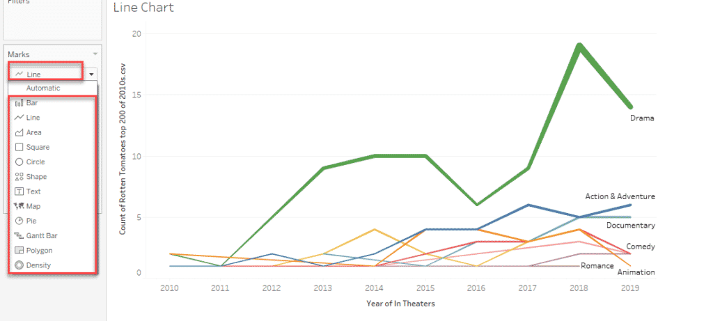
How to convert Chart Types in Tableau
You can see an Automatic option here, click on that option which will have many chart options, clicking anyone among that will change the chart appearance.
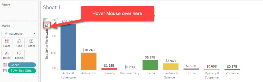
How to Sort a Chart in Tableau
Sorting is a pretty forward step, Hover the mouse over the left side of the chart will show a graph icon, clicking on that will make the sorting in both sending and descending orders.
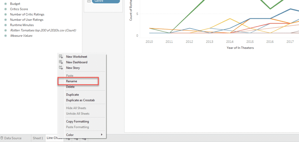
How to Rename a Sheet in Tableau
By default, the new sheet will be named like sheet 1, sheet 2, but when you have multiple sheets involved in real-time projects or reports this can be messy the easiest way to do this is right-click on the sheet you want to rename and select the rename option and give a new name. Similar way you can Delete, Duplicate a Sheet in Tableau.
FINAL VERDICT :
In conclusion, I hope you enjoyed reading this article on “Chart Types in Tableau | Line Chart Implementation”, Next post deals with Handling histogram and Heatmap visualization in Tableau. Check out that post and let our team know what Tableau Tutorial you expect next. Signing off sanjay@recodehive.com